Quintessentially South African.
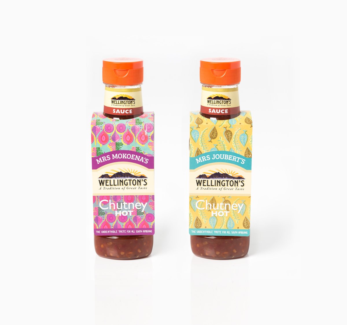
Our team set out to help Wellington’s Chutney stand out against its biggest competitor, Mrs Balls Chutney — a brand that dominated South African shelves. We rebranded Wellington’s, highlighting authentic South African family recipes and designing packaging that would catch the eye while celebrating local flavor.
With comparative advertising restricted, we had to be clever: subtle nods to Mrs Balls, bold visuals, and a tactile, food-inspired approach that referenced the textures and ingredients of each character’s home.
The result? Stronger brand loyalty and a chutney that proudly tastes — and feels — unmistakably South African.
Creative Director: Tseliso Rangaka (Ogilvy), Art Director: Nicola Clarke | Copywriter: Anna Nurse
Illustrations with Flavor


To bring Wellington’s Chutney to life, we created illustrations that literally tasted like home. Using actual ingredients as textures: spices, herbs, and chutney elements. We added a sensory layer that highlighted the authenticity of each family recipe. The visuals combined warmth, color, and cultural cues, making the packaging not just eye-catching, but deliciously memorable.